
Project 01 · Case Study
The Folly
A crenellated stone tower, a long contemporary wing in timber and stone, and one continuous language of light between them.
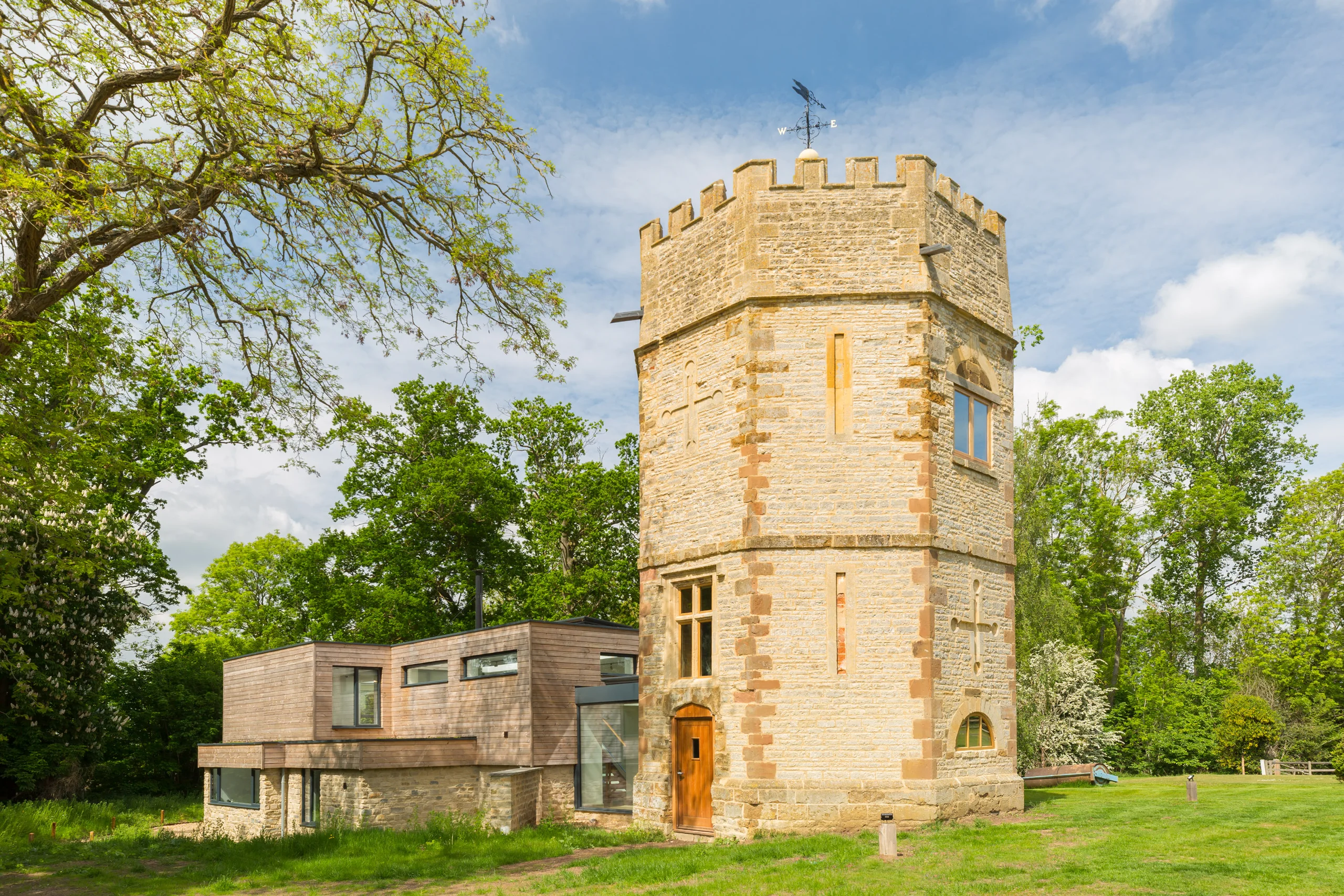
Some buildings hand you the brief on arrival. At one end of the plot stands a castellated folly, square, turreted and unapologetically Gothic, complete with weathervane. Running away from it is its opposite and its complement: a low contemporary wing of timber, stone and frameless glass, planned around rooflights and a pale marble floor. The commission was to photograph the two as one home, holding the weight of the tower and the lightness of the extension in the same frames.
That called for patience with the light. Stone this textured wants low sun raking across it, while the interiors, lit from above, read best in the middle of the day. The set was built across two visits in spring, each timed to what the building needed.
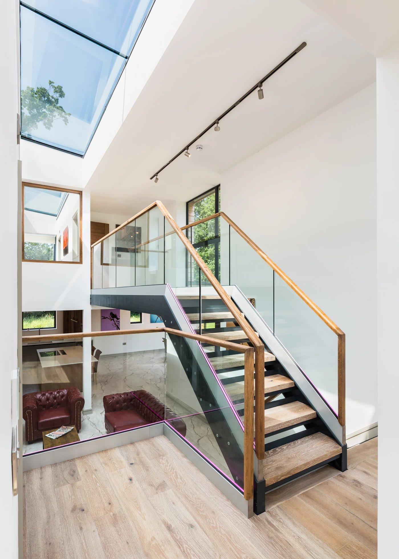
The stair as centrepiece
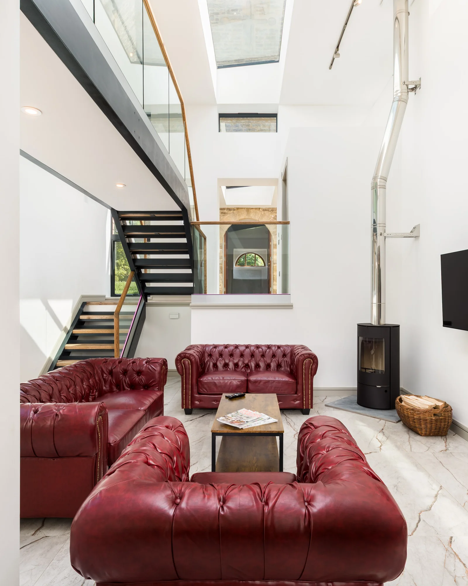
A steel and oak stair rises through the extension beneath a full width rooflight, its glass balustrades keeping every line visible from the floor below. I photographed it square on and level, treads and handrails stacking into a single graphic composition, and let the rooflight carry the daylight all the way down to the marble floor.
The tower sets the rules; the extension plays them back in glass.
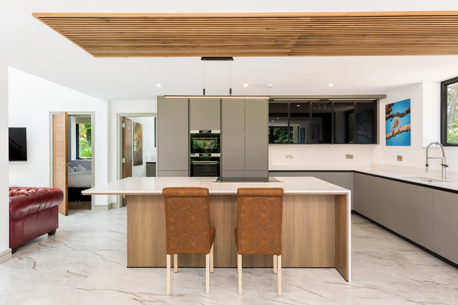
The slatted timber canopy lowers the ceiling over the island.
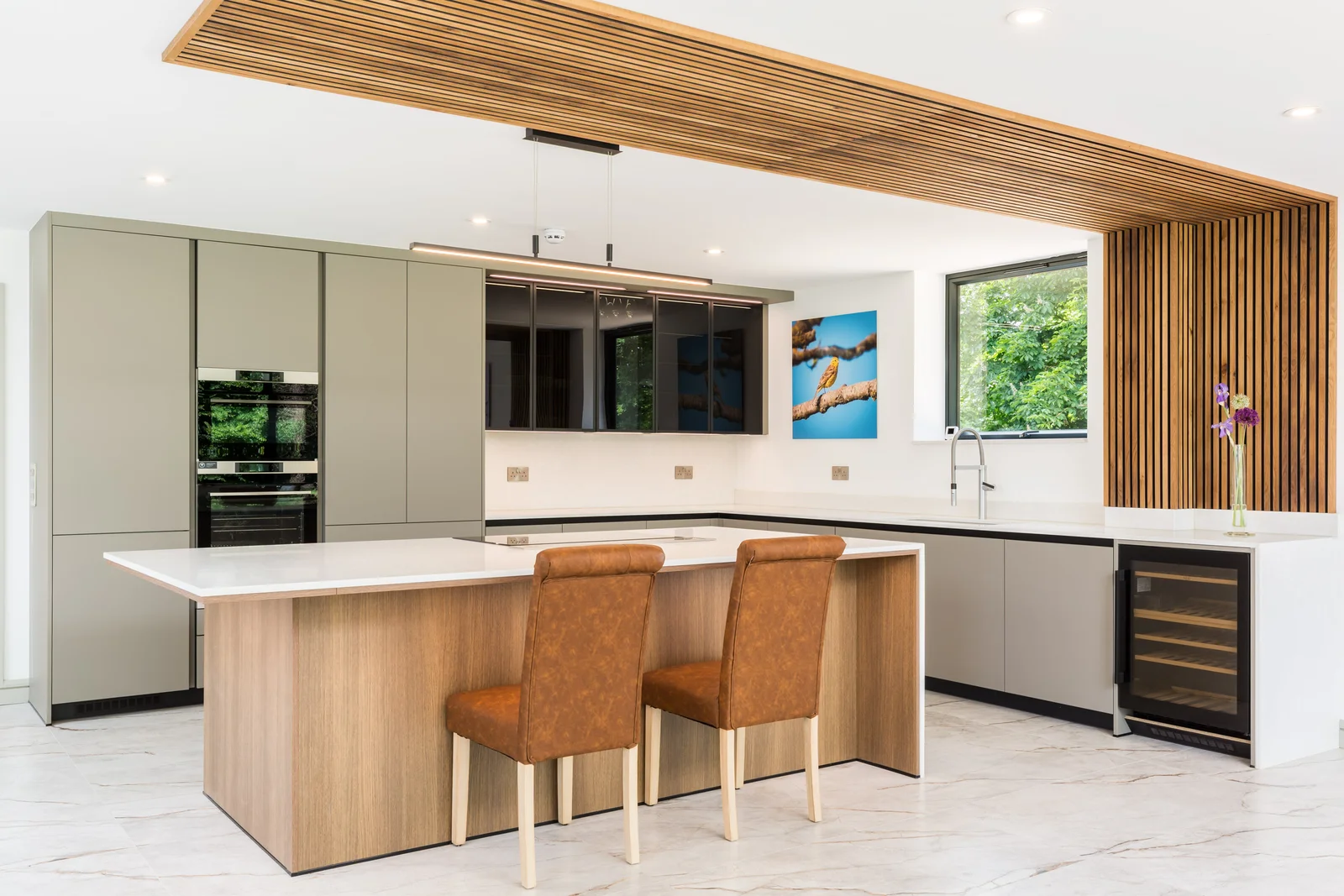
Oak, stone, glass and white: the palette of the wing.
One palette, two buildings
The kitchen sits beneath a slatted timber canopy that warms the white joinery around it. Pale marble floors bounce light back into every frame, so exposures were kept careful and the white balance held steady between rooflight daylight and the warmer tones of the timber. The same palette repeats through the whole wing, and the photography holds it to one consistent reading from room to room.
Double height, deep colour
The sitting room rises through both storeys, oxblood leather chesterfields anchoring the space beneath the stair’s glass edge. Deep saturated leather loses its depth quickly in a bright white room, so the exposures held the highlights on the marble while keeping the red genuinely red, with window light entering at two levels.
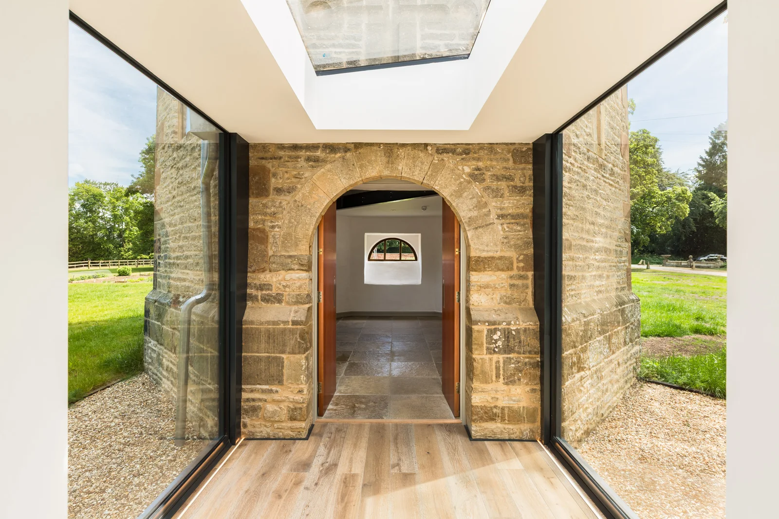
On axis through the stone arch: the junction of tower and wing.
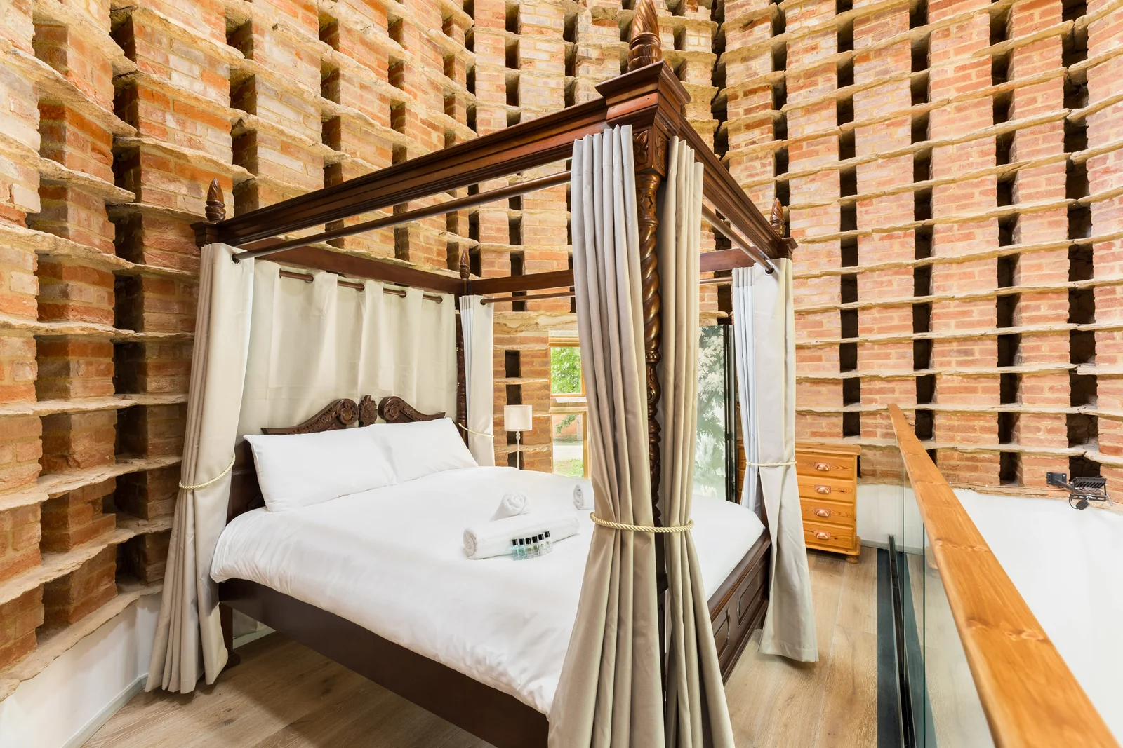
A four poster against a wall of stacked timber.
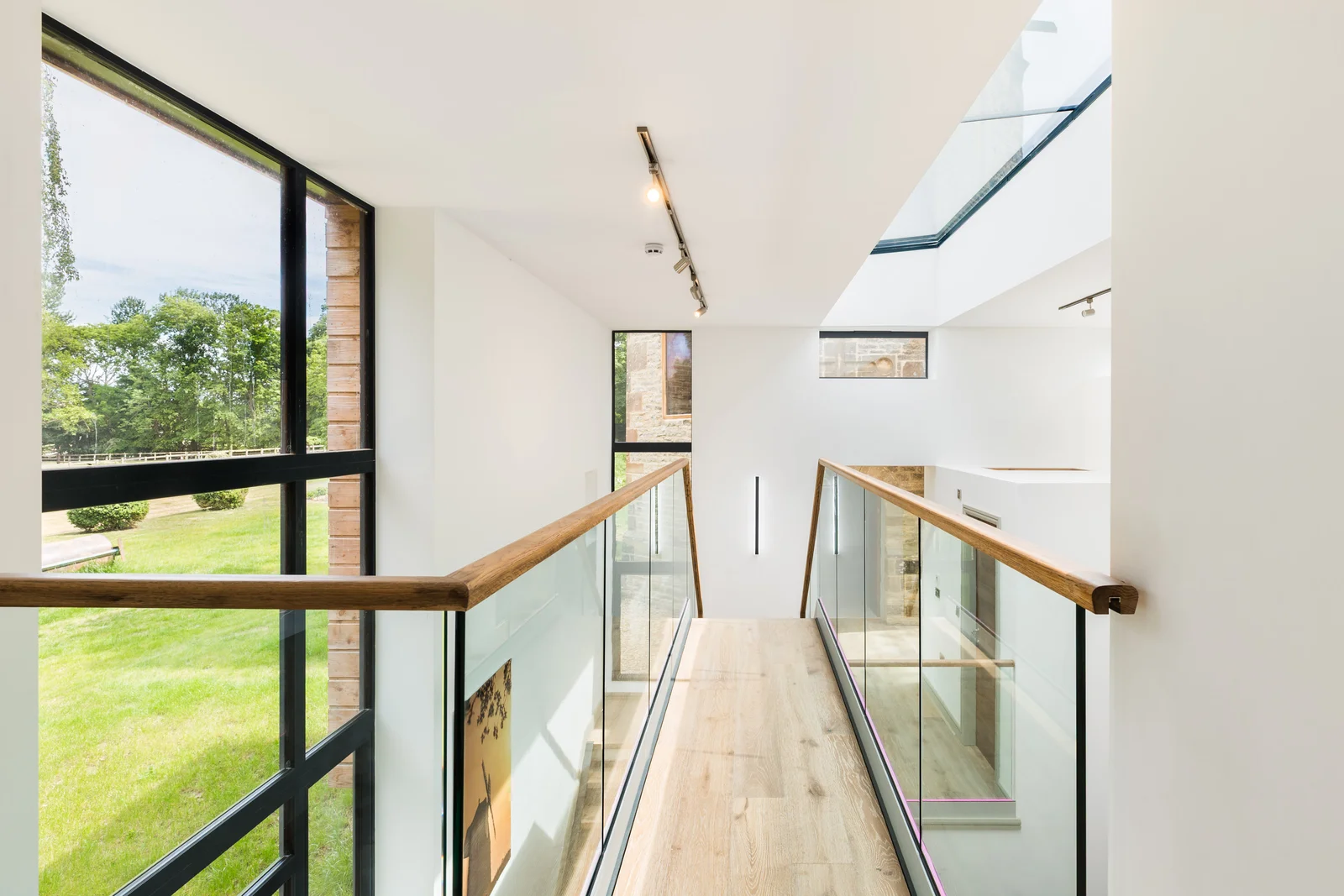
The glazed landing runs toward the garden.
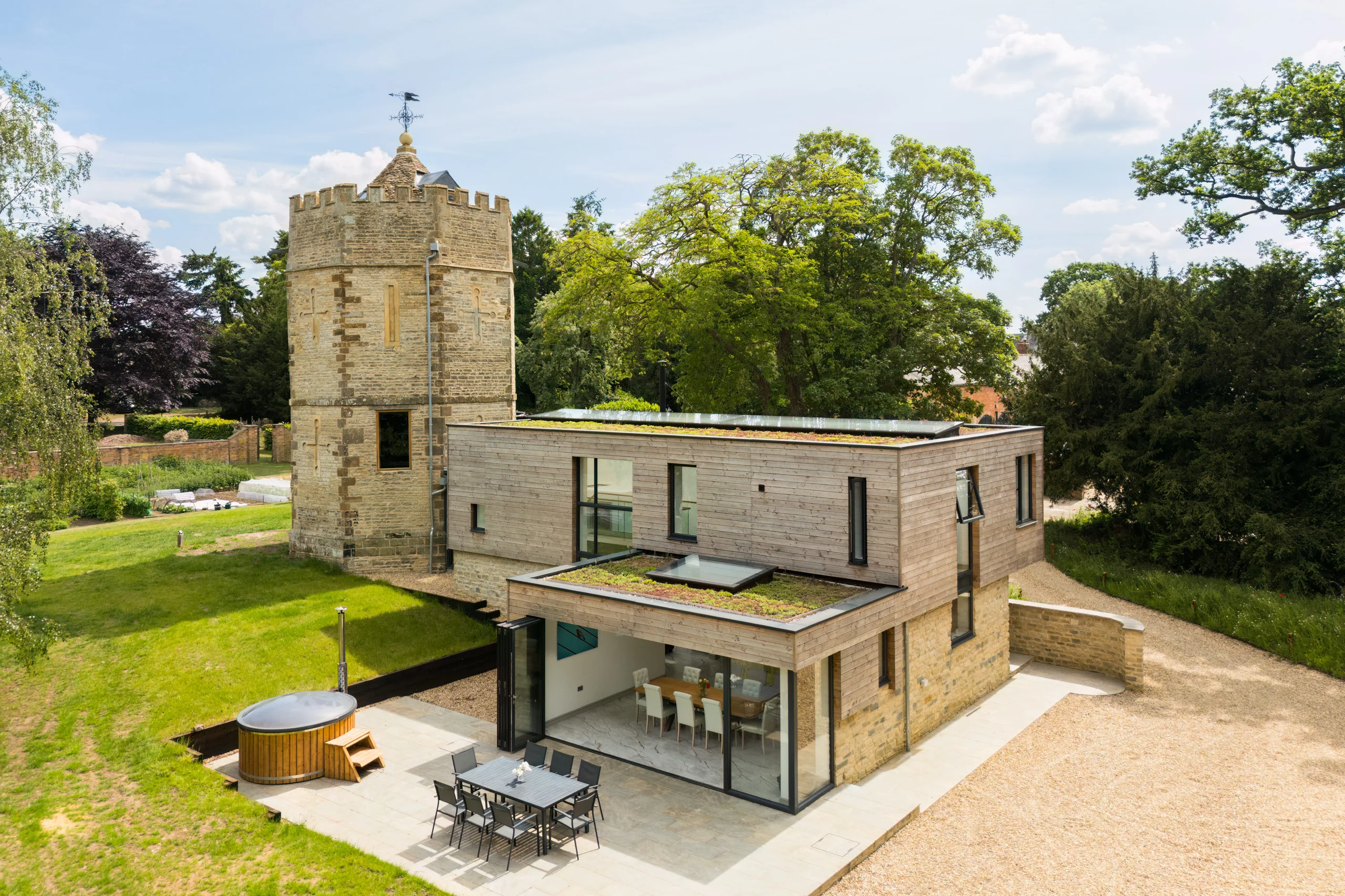
The whole composition, in proportion, from across the parkland.
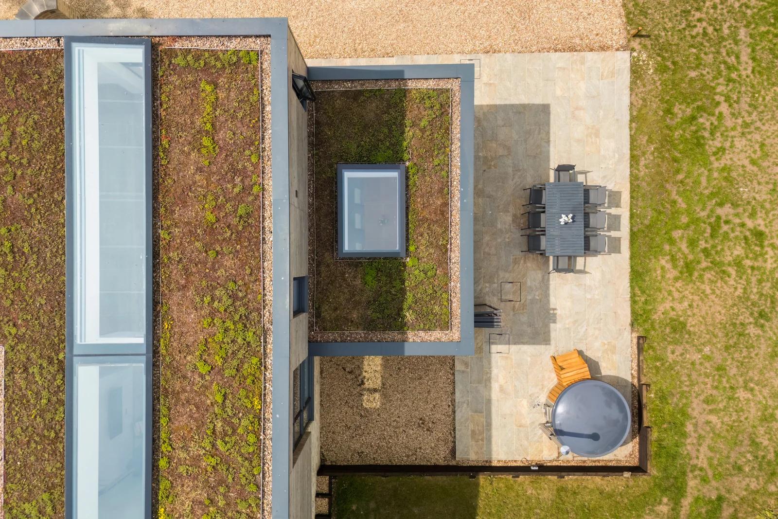
From the air, a plan
Aerial frames complete the set. Elevations from across the parkland place tower and wing in proportion, and a top down frame reads like a site plan, the roof line drawn between old and new. For architects and design teams, these are often the images that explain a scheme fastest.
Delivered as one consistent sequence using ARCHVERA, my method for holding a single palette and exposure across a mixed-light building, the finished set moves from the marble floor to the weathervane without changing its accent, ready for portfolio, press and marketing.